Context
TEF systems (electronic fund transfer infrastructure) are one of the most valuable products in the Brazilian payments market, offering businesses end-to-end sales management.
A strategic shift at Cielo meant the company was moving into new territory, and sales teams needed a dedicated tool to manage the new pipeline. Nothing existed for this model yet.
The challenge
Sales teams had no single place to manage their work.
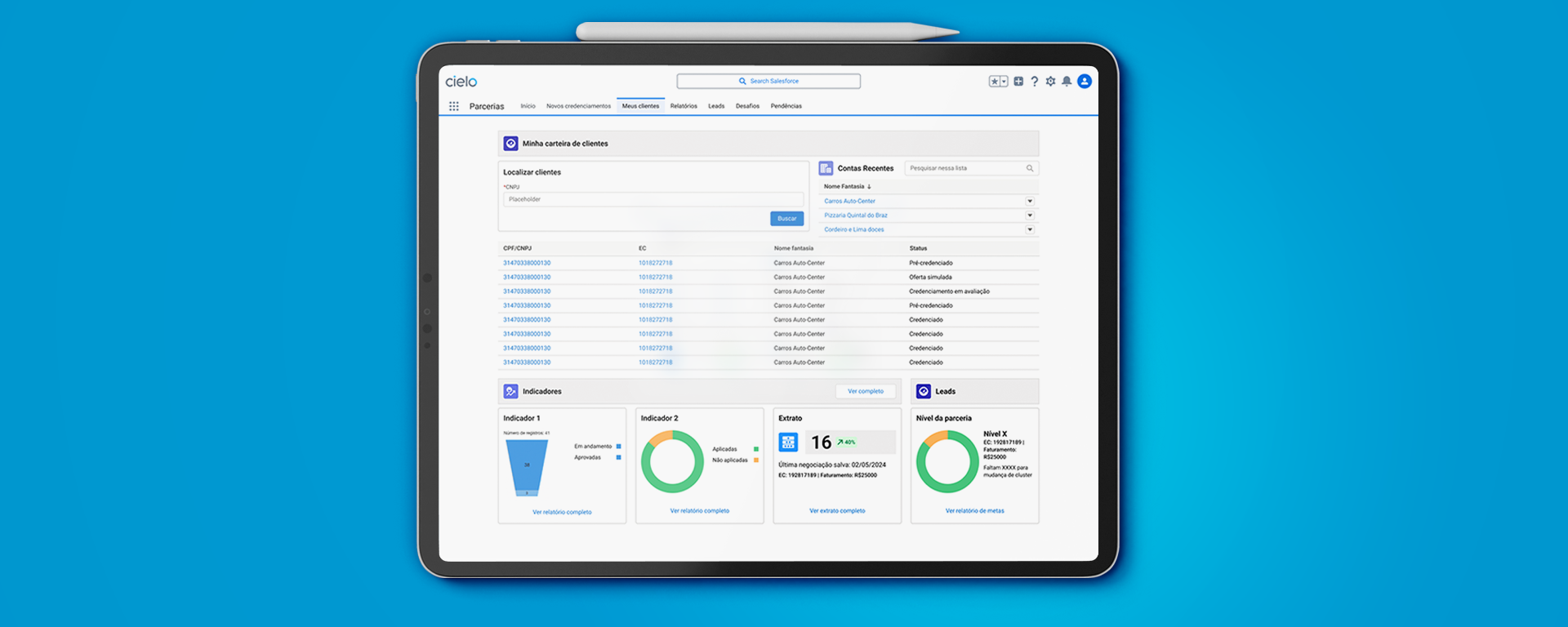
Leads, contract status, and performance data lived in different systems, and reps were spending time assembling context instead of selling. My job was to design a dashboard that consolidated that information and made the new sales motion actually workable.
Research
Over the first month I interviewed businesses evaluating the product, internal sales reps, and account managers, and reviewed how competitors structured similar tooling.
The consistent finding across all three groups: the problem was not the product itself. It was the overhead of managing information about it. Reps were rebuilding context on every client, every time.
Key design decisions
01 · Pipeline stage as the primary view
Decision: The main view is organized by deal stage rather than by client or date, because that is how sales reps think about their day. Deals at risk surface immediately without requiring a manual scan.
02 · Single client profile
Decision: Every piece of information about a partner lives on one profile page, pulled from existing systems. This directly addressed the highest-friction moment from research: the context-switching before a client call.
03 · Salesforce as the foundation
Decision: Designing within Salesforce's component system meant faster adoption and lower overhead for reps already using it for other workflows.
Outcome
Delivered in three months, went into development, and was released under a different name. The product won an innovation award at Cielo.
Specific metrics are confidential. Happy to walk through more detail in a conversation within NDA boundaries.
Reflection
Tight timelines compress the validation loop
Three months was a real constraint for a project with this much organizational complexity. Given more time, I would have pushed for a second research round after the first prototype was in sales reps' hands.
The highest-friction moment can fall outside scope
Research identified the prospect-to-client onboarding flow as the moment that mattered most, but it fell just outside the project scope. I would have invested more there given the chance.